Elements
Every block the theme styles inside an article, drawn once. @primer/css covers most of what Markdown produces; collected here is the rest — what the theme adds on top, and what a change to it is easy to break without noticing. The chrome around the page is on every page anyway.
Each admonition type is its own selector in the stylesheet, so every alias gets a block of its own below rather than a line of prose: a type nobody writes down is a type nobody sees go missing.
Admonitions
The admonition extension emits markup and no CSS, and @primer/css has no rule for .admonition either, so everything below comes from the theme. The shape follows GitHub's alerts — a tinted background, a colored leading rule, a colored title and the octicon for the type.1
Note
note takes Primer's accent blue and the info octicon. Inline code — mkdocs.yml — keeps its own translucent background, which layers over the tint instead of punching a grey hole through it.
Tip
tip takes success green and the light-bulb octicon.
hint
An alias of tip, with a title written by hand so the two can be told apart here.
Important
important takes the purple Primer calls "done", and the report octicon.
Warning
warning takes attention yellow and the alert octicon.
attention
An alias of warning.
caution
The second alias of warning.
Danger
danger takes danger red and the stop octicon.
error
An alias of danger.
bug
The second alias of danger.
Example
A type GitHub has no alert for keeps a neutral fill and a neutral rule, and draws no icon — no colored title, and no gap where an icon would be.
A title of your own, with code in it
The type's color tints the whole title, and against inline code's own background that pairing falls under 4.5:1 — so code in a title is left the default text color.
A block with a title and nothing under it
Quotes
A quote takes the neutral fill at half an admonition's padding: it should read as quieter than an alert, not as another kind of one.
Two paragraphs, to show that the fill closes below the last one rather than below the first.
Code
Fenced blocks are highlighted by Pygments and colored through Primer's prettylights variables, so they follow the color mode. Each one gets a copy button in the corner.
from mkdocs_primer import __version__


def greet(name: str = "world") -> str:
    """Docstrings, keywords, strings and numbers all take separate colors."""
    return f"hello {name} from {__version__}"
A block whose lines are longer than the column scrolls sideways rather than wrapping or stretching the page:
$ mkdocs build --strict -f examples/rss/mkdocs.yml && mkdocs build --strict -f examples/gen-files/mkdocs.yml && mkdocs build --strict -f examples/diagrams/mkdocs.yml
Diffs get their own treatment. The hunk header is the line to watch: it is the one place the highlighting departs from GitHub's palette, because the color GitHub uses there falls under 4.5:1 against the code background in dark mode.
--- a/mkdocs.yml
+++ b/mkdocs.yml
@@ -1,3 +1,3 @@
 theme:
-  name: mkdocs
+  name: primer
Tables
Primer stripes alternate rows and weights the header; the one thing the theme adds is what happens when a table does not fit. Too wide for the column, it scrolls sideways instead of stretching the page — and since a table is not focusable, the theme makes it a tab stop for as long as it overflows, so the part hanging off the edge can be reached without a pointer. The long command above takes exactly the same treatment, and is wide enough to show it.
The surfaces on this page come from @primer/primitives, which is also why they follow the color mode without the theme carrying a second set of rules:
| Token | Light | Dark | Drawn as |
|---|---|---|---|
--bgColor-default | #ffffff | #0d1117 | the article, and the page behind it |
--bgColor-inset | #f6f8fa | #010409 | the header and the sidebar |
--bgColor-muted | #f6f8fa | #151b23 | quotes, and an admonition with no GitHub counterpart |
--bgColor-attention-muted | #fff8c5 | #bb800926 | the fill behind !!! warning |
--button-default-bgColor-rest | #f6f8fa | #212830 | the prev/next cards under this page |
--underlineNav-borderColor-active | #fd8c73 | #f78166 | the mark on the current page in the sidebar |
Definition lists
The def_list extension takes a plainer syntax than the raw HTML below it:
docs_dir-
Directory MkDocs reads Markdown from.
site_dir-
Directory MkDocs writes HTML to.
Both reach Primer as the same <dl>, which is the point of drawing them together — a rule written against one applies to the other:
- Name
- Godzilla
- Born
- 1952
- Birthplace
- Japan
Images
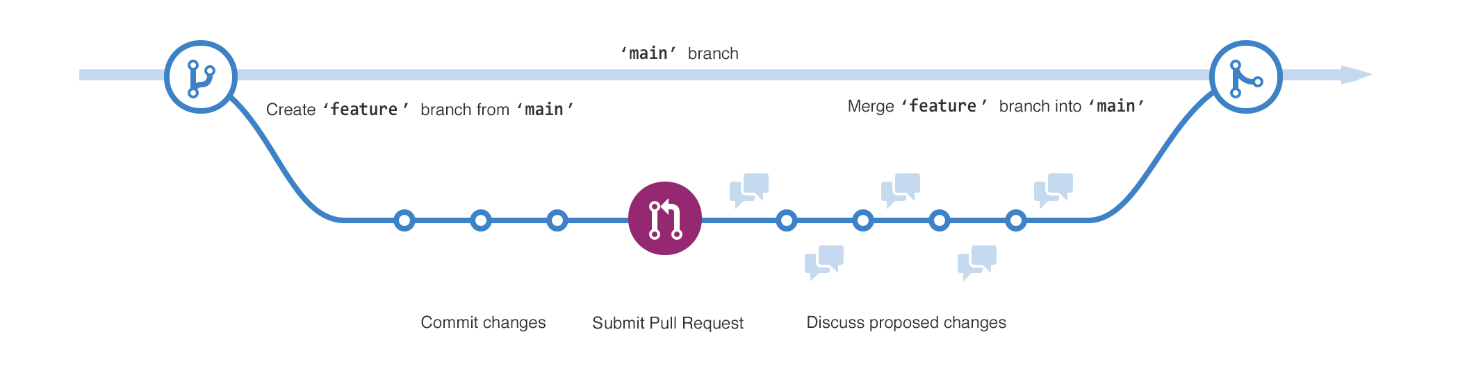
The width of the column is the theme's — .primer-content carries the ceiling that keeps prose off a 130-character line — so an image wider than that column is worth having on a page. It should be held to the column rather than pushing the layout sideways.
These are also the only content images on the site, which makes them the only thing mkdocs-glightbox has to work with — click one and it opens in a lightbox.

Headings
The headings on this page are what the outline in the right-hand rail is built from, and each one carries a permalink that appears on hover — an octicon the theme draws over the anchor the toc extension emits.
A third level
Nested headings indent in the outline, so this one sits under Headings there.
A fourth level
Deep enough to show that the outline keeps indenting, and that a rail entry this far in still has room for its text.
-
GitHub renders its own alerts with a
.markdown-alertclass that@primer/cssdoes not publish, so the theme styles the extension's.admonitionmarkup directly. This footnote is also what exercises thefootnotesextension. ↩